Exceeding SaaS survey engagement average by 42%

Project Summary
Shifted the team to a worker-first approach that met business needs with minimal friction.
First-of-its-kind feedback survey for partner employees in Healthcare, Hospitality, and Retail.
Impact
Reached 10% response rate (7% SaaS average)
Led redirection to a worker-first strategy
Leveraged transparent design to drive agency
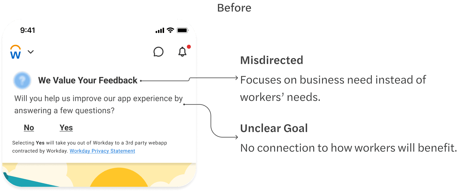
Research findings prioritized high visibility over worker productivity
Three interactions were tested to quantify annoyance, discoverability, and disruptiveness.
Results favored high visibility, despite showing significant friction.
In Feed

Banner

0% annoyance
66.7% discoverability
12.5% disruptive
Customized component

Advocating for those not in the room
Workers rely on the app for essential tasks such as clocking in, managing PTO, or reviewing pay.
A blocking modal could create "Urgency Friction," adding unnecessary stress.
Risks include someone running late or navigating a personal crisis while using the app.
Highlighting these risks showed that forcing engagement could function as an obstacle.
Prioritizing Worker Agency
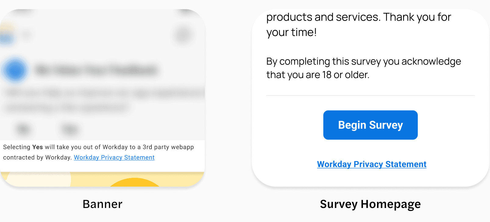
The discovery phase showed the banner would be the best direction.
Stays persistent to maintain high visibility on the homepage.
Allow workers to complete intended tasks without interruption.
Using messaging guidelines for support
My Messaging Components and Guidelines supported the recommended direction.
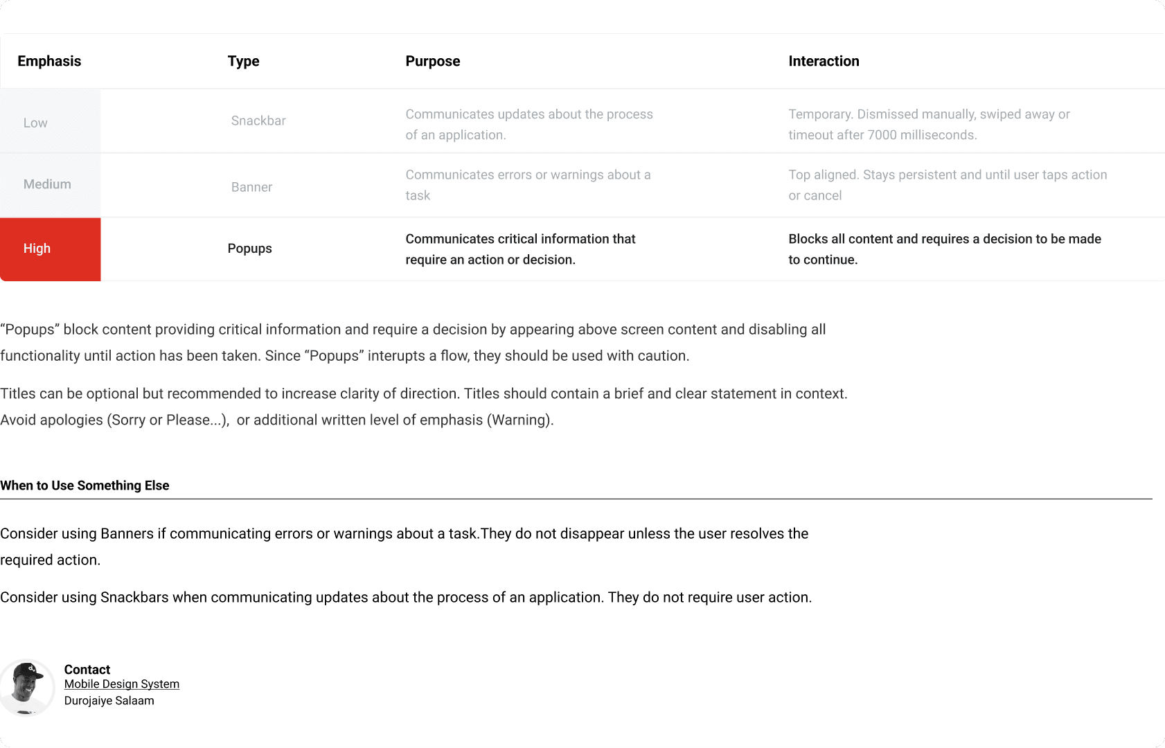
Popups were high emphasis and reserved for critical decisions.
The survey was vital to the business, but it was not a priority for workers.
Crafted messaging components to ensure scalability.
Supports denser content while maintaining scannability and readability.

"Banner" fulfills the business need for discoverability without interrupting task completion.
Partnering for simplicity
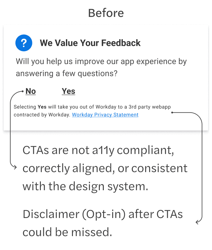
Set up time with Legal and Content Design.
Goals: Reduce cognitive load and ensure workers understand the survey's source and purpose.
Reached out to legal to see if we could simplify the layout.
Advocated to remove duplicate privacy links to prioritize the primary "Yes/No" actions.
The privacy link seemed in better context on the survey’s homepage.
The disclaimer and privacy links remained requirements after Legal’s risk assessment.
Refining copy for clarity

Collaborated with Content Design to clarify the purpose and goal of the survey.
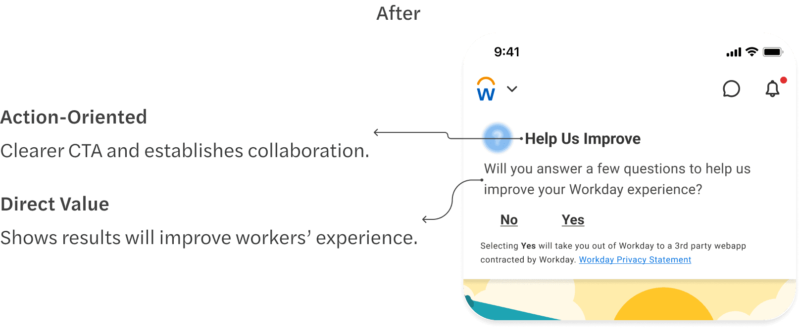

Finalizing for accessibility and transparency
Began design polish to address accessibility, transparency, and ensure experience consistency.


The final design met accessibility standards and was consistent with the design system.
Improved information hierarchy to improve transparency.
An optimized design shipped with business and worker needs met
Balanced business and legal requirements with a worker-first approach.
Banner provided worker agency by not blocking core tasks.
Refined visual hierarchy and accessibility standards to increase overall clarity.
Collaborated with cross-functional partners to achieve the best result.
Third-party platform used for the survey.
Proving worker agency drives high engagement
A worker-first approach delivered a 42% increase over the SaaS average.
Engagement rate
SaaS Average
Lessons, growth, and change
Creating solid team collaboration and process is just as important as crafting great experiences.
I stopped treating team alignment as a side task and made it a part of the design process.
I prioritize transparent communication through weekly syncs to establish feedback channels, ensuring consistency and raising collective UX maturity.