
Workday
15,213 responses in one quarter using an employee-friendly approach while meeting business needs.
The initial survey design risked interrupting employee tasks, potentially causing frustration and increasing stress (especially for those running late), and potentially hindering participation. I focused on minimizing disruption and friction, to maximize participation, and delivered a design that prioritized the employee experience and met the business need for visibility.
B2B
SaaS
UX Strategy
Timeline
2 Weeks
Role
Lead Mobile Designer
Team
1x Product Designer
2x Product Manager
2x Developers
1x Content Designer
1x Accessibility (a11y)
1x Legal
Challenge
The survey could only be shown right after login.
Getting the team to change their design decision.
Impact
Achieved 15,213 responses in the first quarter.
Influenced design direction for improved experience, keeping business goals aligned.
Revised design without delaying development timeline.
Collaborated with Content Design to enhance copy and a11y to meet accessibility.
qualitative testing
3 Ideas tested with 34 participants
The Initial design direction was informed by the LEAP team's (a cross-functional partner) qualitative testing of three designs. The test was to learn about discoverability, annoyance, and disruptiveness.
In Feed (11 participants)
36.4 discoverability
25% annoyance
0% disruptive

Banner (12 participants)
66.7% discoverability
0% annoyance
12.5% disruptive
Popup (11 participants)
100% discoverability
45.5% annoyance
36.4% disruptive
Testing Recommendation
Use the Popup because it has the greatest discoverability. 🤔
With a 5% sample rate, greatly increased visibility is worth a slight and probable temporary annoyance. 🤔
Assessment
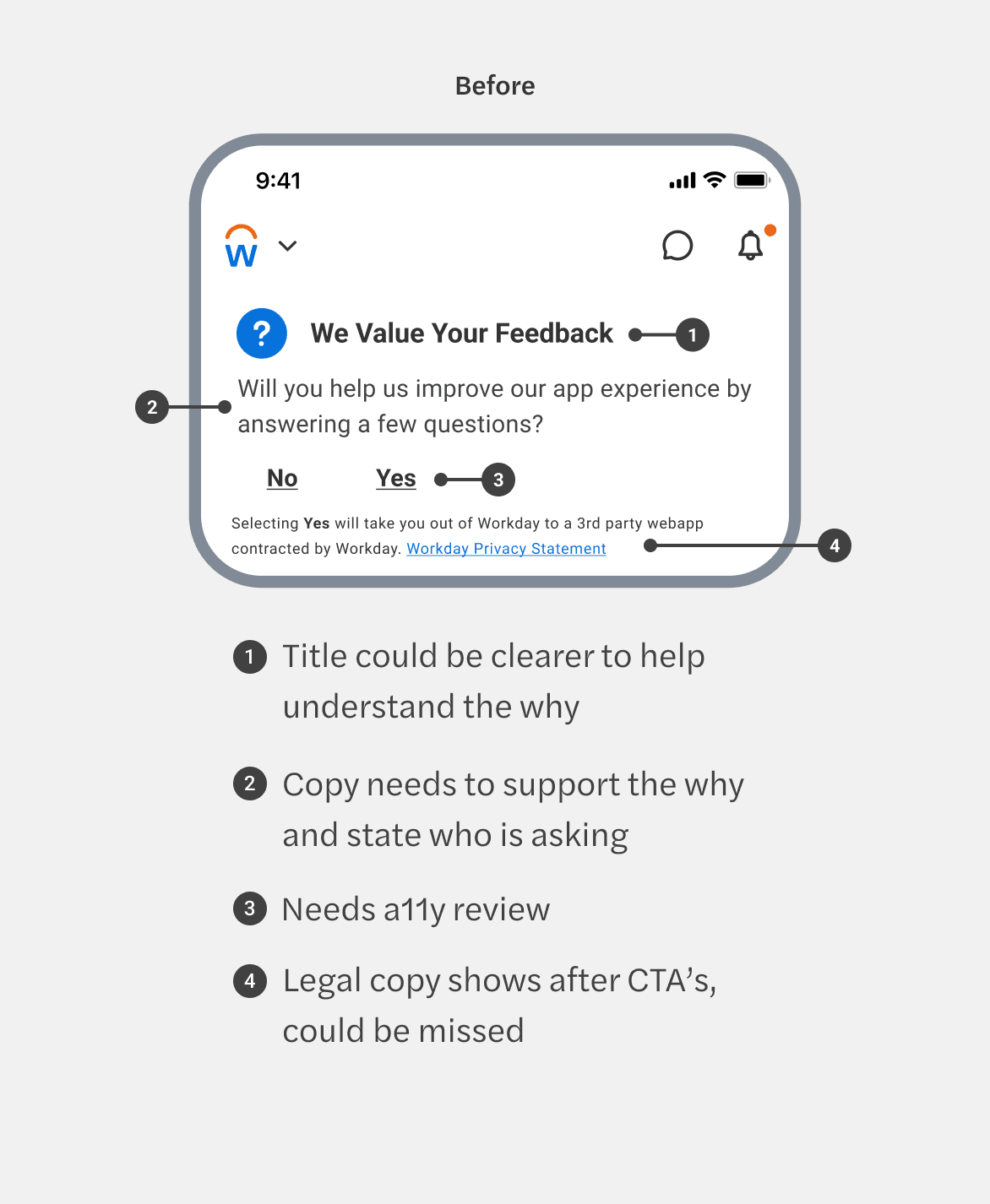
Questioning test findings and recommendation
After reviewing the findings and assessing stress cases, I had the following concerns:
My Internal Dialogue
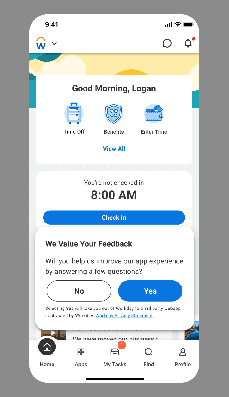
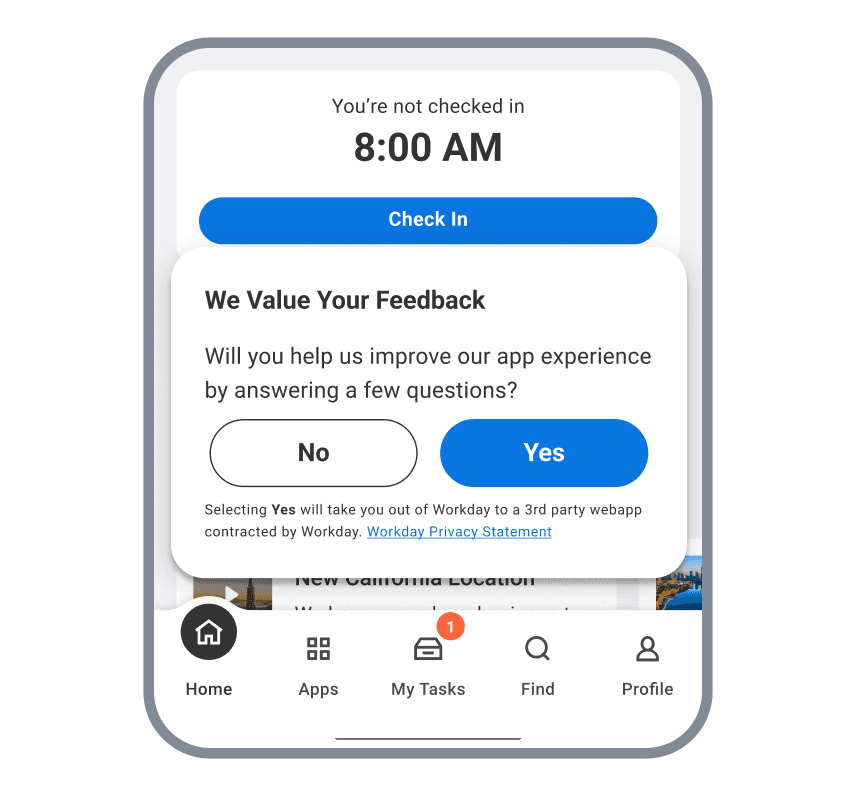
If someone is running late and forced to exit a popup to complete the task, will it cause frustration?
Blocking people from completing a task like clocking could cause frustration.
Are we designing for discoverability or interaction to complete the survey?
A popup communicates critical information that requires action or decision only.
A survey is not critical information to employees. We need another alternative.
Questions to the Team
How would you feel if you were running late, with a couple of minutes left to clock in, and forced to dismiss a popup?
Are we designing for discoverability or interaction to complete the survey?
If we're designing for interaction, not interrupting employee tasks should be our top priority.
This variation of the Popup would require customization. Is there enough time within the timeline to build it if we go in that direction?
Getting buy-in
Presenting findings and recommendation to stakeholders.
Video Summary
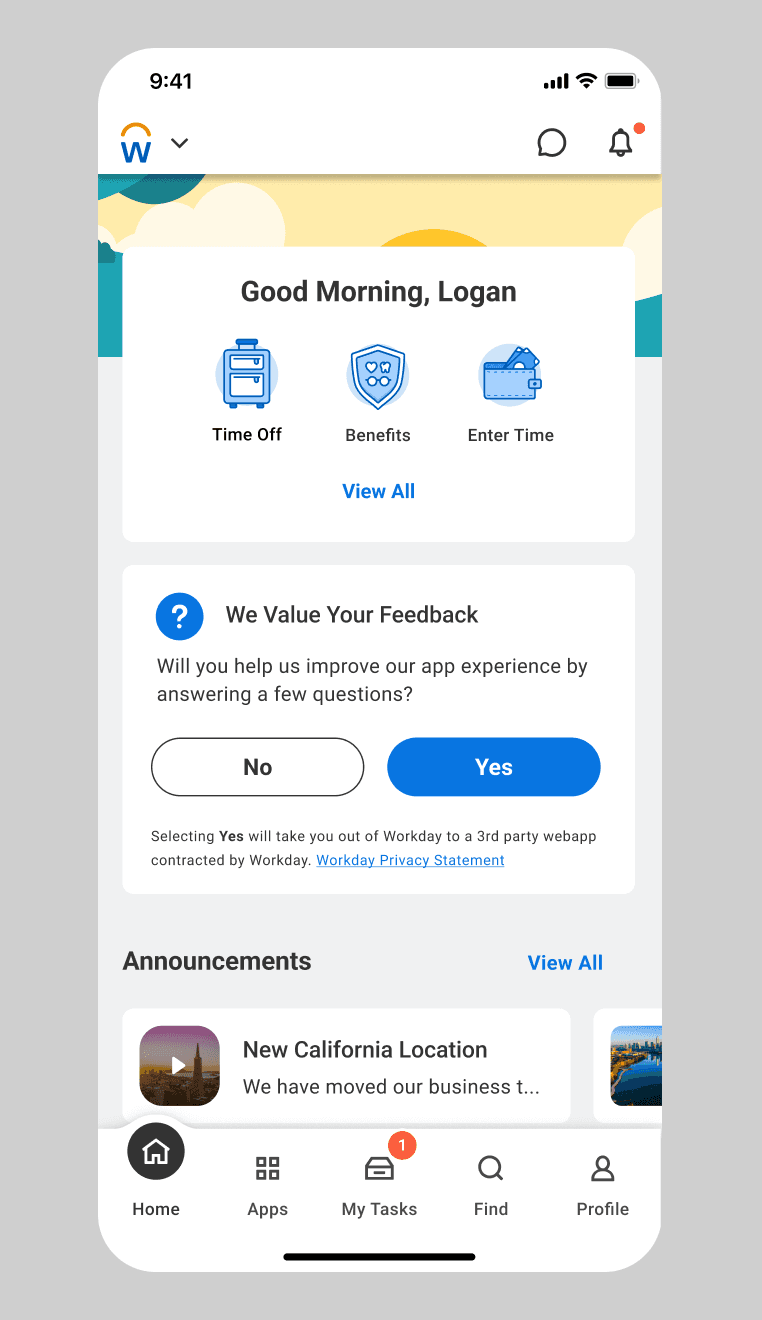
Problem With Proposed Design
The Popup has the highest annoyance (36.4%) and disruptiveness (45.5%).
Will interrupt intended tasks and cause frustration.
Tap or scroll will dismiss the Popup.
A Popup is used to share critical information, blocks functionality, and should be used cautiously (Component guidelines).
Critical for the business because feedback is needed to improve, but not critical to employees .
Remember: Employees come in only to do specific tasks (e.g., check-in/check-out for shifts, review and request PTO, view paystubs, etc) - This will cause frustration and stress if someone is running late.
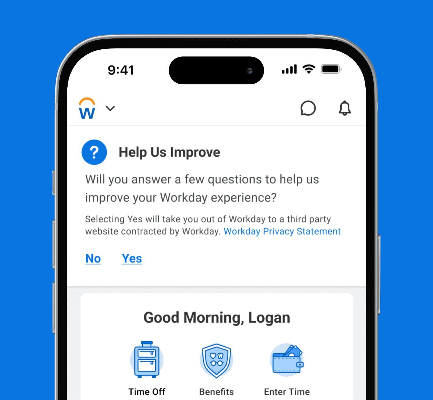
Recommendation: The Banner
From a Business standpoint
66.7% discoverable, persistent, and requires interaction - Employees will see it.
From an Employee standpoint
0% annoyance, 12.5% disruptive -
Less intrusive.
Does not block intended tasks.
Employees can participate by choice. A popup feels forced.

Next Steps
Align on timeframe to resurface banner if navigated to another page.
Meet with a11y to ensure accessibility is met.
Collaborate with Content to improve title and sub-copy so employees know why and who requests feedback.
Meet with Legal to assess if copy can be shortened or removed since it is duplicated on the survey home page.
Present to Mobile for approval to ensure the final design meets mobile standards.
Popup component will be ready in October so that we can meet the release date.
Improving the design
Updating the design to meet mobile standards
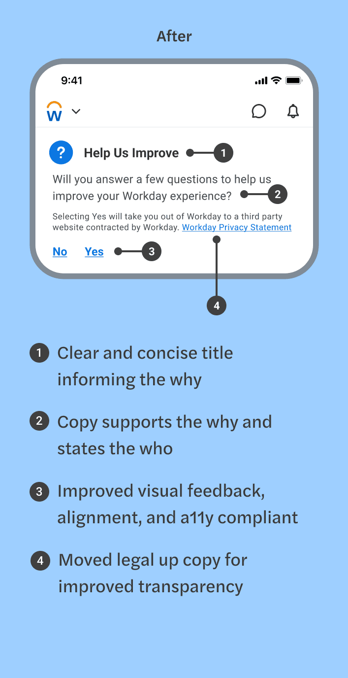
To align with mobile design standards, I refined the UI and collaborated with Content Design and Accessibility (a11y) for the final design.
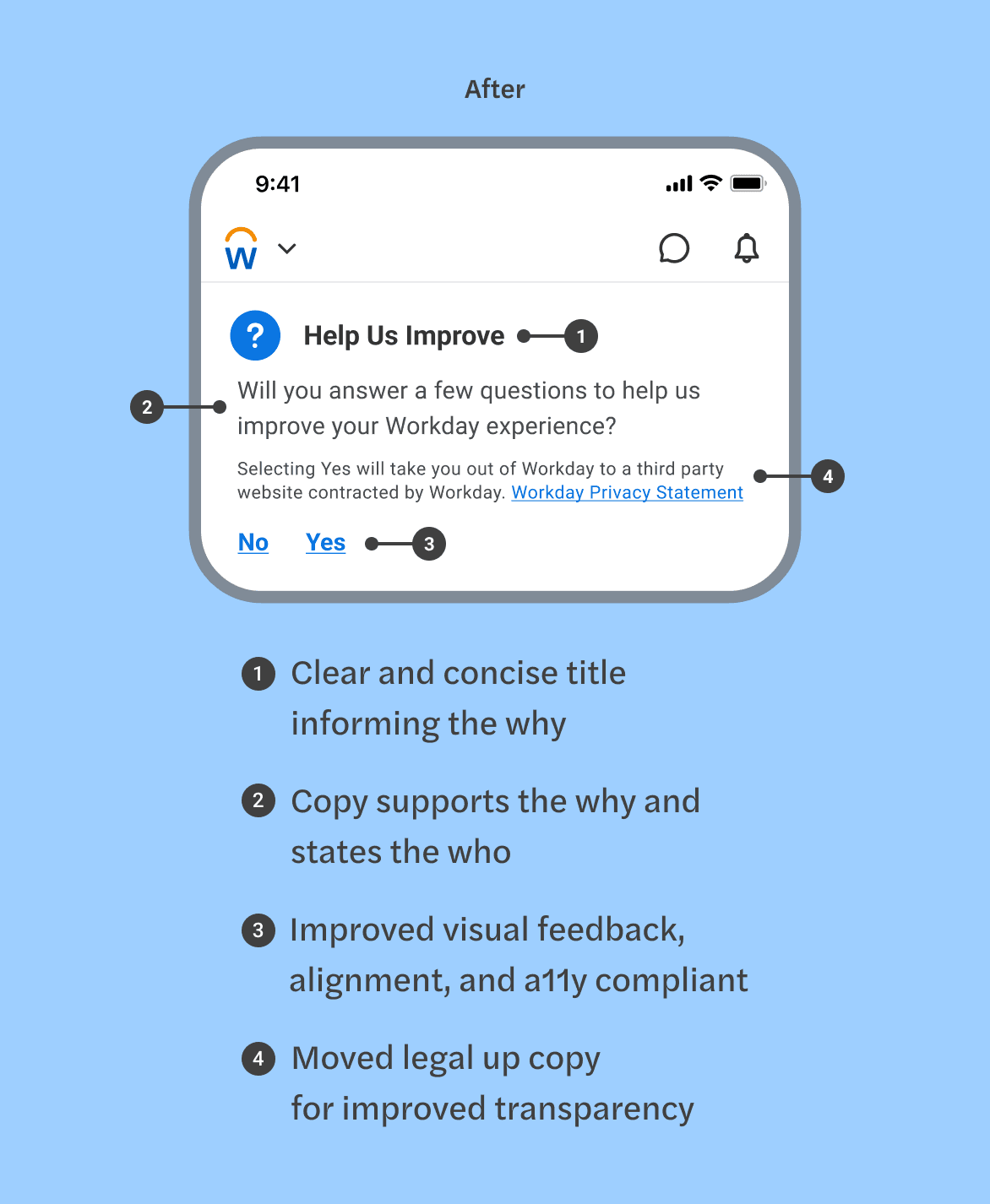
Final Survey Design
Meeting employee and business needs.
Shortly after seeing design polish through development, we launched the final design and received 15,213 responses in one quarter.
The design met employee needs by not blocking any intended tasks and giving them the agency to choose whether to participate.
The design met business needs by having a persistent banner for employees to willingly give feedback or choose not to, resulting in significant engagement.
Third-party survey platform used.
Workday
Workday
15,213 responses in one quarter using an employee-friendly approach while meeting business needs.
The initial survey design risked interrupting employee tasks, potentially causing frustration and increasing stress (especially for those running late), and potentially hindering participation. I focused on minimizing disruption and friction, to maximize participation, and delivered a design that prioritized the employee experience and met the business need for visibility.
B2B
SaaS
UX Strategy
Timeline
2 Weeks
Role
Lead Mobile Designer
Team
1x Product Designer
2x Product Manager
2x Developers
1x Content Designer
1x Accessibility (a11y)
1x Legal
Challenge
The survey could only be shown right after login.
Getting the team to change their design decision.
Impact
Influenced design direction for improved experience, keeping business goals aligned.
Revised design without delaying development timeline.
Collaborated with Content Design to enhance copy and a11y to meet accessibility.
Achieved 15,213 responses in the first quarter.
Qualitative Testing
Qualitative Testing
3 Ideas tested with 34 participants
The Initial design direction was informed by the LEAP team's (a cross-functional partner) qualitative testing of three designs. The test was to learn about discoverability, annoyance, and disruptiveness.
In Feed (11 participants)
36.4 discoverability
25% annoyance
0% disruptive
Banner (12 participants)
66.7% discoverability
0% annoyance
12.5% disruptive
Popup (11 participants)
100% discoverability
45.5% annoyance
36.4% disruptive
Testing Recommendation
Testing Recommendation
Use the Popup because it has the greatest discoverability. 🤔
With a 5% sample rate, greatly increased visibility is worth a slight and probable temporary annoyance. 🤔
Assessment
Assessment
Questioning test findings and recommendation
After reviewing the findings and assessing stress cases, I had the following concerns:
My Internal Dialogue
My Internal Dialogue
If someone is running late and forced to exit a popup to complete the task, will it cause frustration?
Blocking people from completing a task like clocking could cause frustration.
A survey is not critical information to employees. We need another alternative.
Are we designing for discoverability or interaction to complete the survey?
A popup communicates critical information that requires action or decision only.
Questions to the Team
Questions to the Team
How would you feel if you were running late, with a couple of minutes left to clock in, and forced to dismiss a popup?
Are we designing for discoverability or interaction to complete the survey?
This variation of the Popup would require customization. Is there enough time within the timeline to build it if we go in that direction?
If we're designing for interaction, not interrupting employee tasks should be our top priority.
Assessment
Questioning test findings and recommendation
After reviewing the findings and assessing stress cases, I had the following concerns:
My Internal Dialogue
If someone is running late and forced to exit a popup to complete the task, will it cause frustration?
Blocking people from completing a task like clocking could cause frustration.
Are we designing for discoverability or interaction to complete the survey?
A popup communicates critical information that requires action or decision only.
A survey is not critical information to employees. We need another alternative.
Questions to the Team
How would you feel if you were running late, with a couple of minutes left to clock in, and forced to dismiss a popup?
Are we designing for discoverability or interaction to complete the survey?
If we're designing for interaction, not interrupting employee tasks should be our top priority.
This variation of the Popup would require customization. Is there enough time within the timeline to build it if we go in that direction?
Connect to Content
Add layers or components to swipe between.


Getting buy-in
Getting buy-in
Presenting findings and recommendation to stakeholders.
Video Summary
Problem With Proposed Design
Problem With Proposed Design
The Popup has the highest annoyance and disruptiveness.
Will interrupt intended tasks and cause frustration.
Tap or scroll will dismiss the Popup.
A Popup is used to share critical information, blocks functionality, and should be used cautiously (Component guidelines).
Critical for the business because feedback is needed to improve, but not critical to employees .
Remember: Employees come in only to do specific tasks (e.g., check-in/check-out for shifts, review and request PTO, view paystubs, etc) - This will cause frustration and stress if someone is running late.
Recommendation: The Banner
Recommendation: The Banner
From a Business standpoint
From an Employee standpoint
66.7% discoverable, persistent, and requires interaction - Employees will see it.
0% annoyance, 12.5% disruptive - Less intrusive.
Does not block intended tasks.
Employees can participate by choice. A popup feels forced.
Next Steps
Next Steps
Align on timeframe to resurface banner if navigated to another page.
Meet with a11y to ensure accessibility is met.
Collaborate with Content to improve title and sub-copy so employees know why and who requests feedback.
Meet with Legal to assess if copy can be shortened or removed since it is duplicated on the survey home page.
Present to Mobile for approval to ensure the final design meets mobile standards.
Popup component will be ready in October so that we can meet the release date.
New Design
New Design
Updating the design to meet mobile standards
To align with mobile design standards, I refined the UI and collaborated with Content Design and Accessibility (a11y) for the final design.

Final Survey Design
Final Survey Design
Meeting employee and business needs.
Shortly after seeing design polish through development, we launched the final design and received 15,213 responses in one quarter.
The design met employee needs by not blocking any intended tasks and giving them the agency to choose whether to participate.
The design met business needs by having a persistent banner for employees to willingly give feedback or choose not to, resulting in significant engagement.
Third-party survey platform used.

Workday
Workday
15,213 responses in one quarter using an employee-friendly approach while meeting business needs.
The initial survey design risked interrupting employee tasks, potentially causing frustration and increasing stress (especially for those running late), and potentially hindering participation. I focused on minimizing disruption and friction, to maximize participation, and delivered a design that prioritized the employee experience and met the business need for visibility.
B2B
SaaS
UX Strategy
Timeline
2 Weeks
Role
Lead Mobile Designer
Team
1x Product Designer
2x Product Manager
2x Developers
1x Content Designer
1x Accessibility (a11y)
1x Legal
Challenge
The survey could only be shown right after login.
Getting the team to change their design decision.
Impact
Influenced design direction for improved experience, keeping business goals aligned.
Revised design without delaying development timeline.
Collaborated with Content Design to enhance copy and a11y to meet accessibility.
Achieved 15,213 responses in the first quarter.
Qualitative Testing
Qualitative Testing
3 Ideas tested with 34 participants
The Initial design direction was informed by the LEAP team's (a cross-functional partner) qualitative testing of three designs. The test was to learn about discoverability, annoyance, and disruptiveness.

In Feed (11 participants)
36.4 discoverability
25% annoyance
0% disruptive

Banner (12 participants)
66.7% discoverability
0% annoyance
12.5% disruptive

Popup (11 participants)
100% discoverability
45.5% annoyance
36.4% disruptive
Testing Recommendation
Testing Recommendation
Use the Popup because it has the greatest discoverability. 🤔
With a 5% sample rate, greatly increased visibility is worth a slight and probable temporary annoyance. 🤔
Assessment
Assessment
Questioning test findings and recommendation
After reviewing the findings and assessing stress cases, I had the following concerns:
My Internal Dialogue
My Internal Dialogue
If someone is running late and forced to exit a popup to complete the task, will it cause frustration?
Blocking people from completing a task like clocking could cause frustration.
A survey is not critical information to employees. We need another alternative.
Are we designing for discoverability or interaction to complete the survey?
A popup communicates critical information that requires action or decision only.
Questions to the Team
Questions to the Team
How would you feel if you were running late, with a couple of minutes left to clock in, and forced to dismiss a popup?
Are we designing for discoverability or interaction to complete the survey?
This variation of the Popup would require customization. Is there enough time within the timeline to build it if we go in that direction?
If we're designing for interaction, not interrupting employee tasks should be our top priority.


Getting buy-in
Getting buy-in
Presenting findings and recommendation to stakeholders.
Video Summary
Problem With Proposed Design
Problem With Proposed Design
The Popup has the highest annoyance and disruptiveness.
Will interrupt intended tasks and cause frustration.
Tap or scroll will dismiss the Popup.
A Popup is used to share critical information, blocks functionality, and should be used cautiously (Component guidelines).
Critical for the business because feedback is needed to improve, but not critical to employees .
Remember: Employees come in only to do specific tasks (e.g., check-in/check-out for shifts, review and request PTO, view paystubs, etc) - This will cause frustration and stress if someone is running late.
Recommendation: The Banner
Recommendation: The Banner
From a Business standpoint
From an Employee standpoint
66.7% discoverable, persistent, and requires interaction - Employees will see it.
0% annoyance, 12.5% disruptive - Less intrusive.
Does not block intended tasks.
Employees can participate by choice. A popup feels forced.
Next Steps
Next Steps
Align on timeframe to resurface banner if navigated to another page.
Meet with a11y to ensure accessibility is met.
Collaborate with Content to improve title and sub-copy so employees know why and who requests feedback.
Meet with Legal to assess if copy can be shortened or removed since it is duplicated on the survey home page.
Present to Mobile for approval to ensure the final design meets mobile standards.
Popup component will be ready in October so that we can meet the release date.
New Design
New Design
Updating the design to meet mobile standards
To align with mobile design standards, I refined the UI and collaborated with Content Design and Accessibility (a11y) for the final design.


Final Survey Design
Final Survey Design
Meeting employee and business needs.
Shortly after seeing design polish through development, we launched the final design and received 15,213 responses in one quarter.
The design met employee needs by not blocking any intended tasks and giving them the agency to choose whether to participate.
The design met business needs by having a persistent banner for employees to willingly give feedback or choose not to, resulting in significant engagement.
Third-party survey platform used.